Chat Widget Placement: Position, Timing, Greeting
Where the chat widget belongs, how big it may be on mobile and when to engage proactively without annoying anyone. Plan placement, timing and starter message.
In plain language
Where the chat window sits affects your results. It should be easy to see. But it must not cover anything, such as the buy button or required details. On a phone, smaller is better. A large window gets closed fast. Only reach out to visitors with a good reason, such as doubt at checkout. A concrete offer works better than just asking if you can help. If the window opens again unasked, it annoys people.
An AI chat assistant can answer ever so cleverly: if nobody notices it or it interrupts at the wrong moment, its effect fails to appear. Between an assistant visitors gladly use and one they immediately click away lie rarely the answers themselves, but the design: where the widget sits, how big it is on the smartphone, whether it covers the header and whether it speaks up at the right moment. The numbers show how much depends on it. Forty-five percent (Forrester) of customers used web chat in 2017 to interact with a live agent, and those who use the chat convert at roughly 2.8 times (Forrester) the rate of those who do not. This article is not about the technology of embedding, but about design and effect: placement, size, behaviour on mobile, proactive engagement with sensible timing, and the starter message and quick replies that turn a mute icon into a conversation.
%3C%2Ftext%3E%3Crect%20x%3D'520'%20y%3D'214'%20width%3D'248'%20height%3D'194'%20rx%3D'12'%20fill%3D'%23ffffff'%20stroke%3D'%23cbd5e1'%20stroke-width%3D'1.3'%2F%3E%3Ctext%20x%3D'536'%20y%3D'238'%20font-family%3D'system-ui%2C%20sans-serif'%20font-size%3D'10.5'%20font-weight%3D'700'%20fill%3D'%23312e81'%3EWhy%20placement%20matters%3C%2Ftext%3E%3Crect%20x%3D'536'%20y%3D'250'%20width%3D'216'%20height%3D'44'%20rx%3D'8'%20fill%3D'%23eef2ff'%20stroke%3D'%23c7d2fe'%20stroke-width%3D'1'%2F%3E%3Ctext%20x%3D'550'%20y%3D'278'%20font-family%3D'system-ui%2C%20sans-serif'%20font-size%3D'16'%20font-weight%3D'800'%20fill%3D'%234f46e5'%3E2.8x%3C%2Ftext%3E%3Ctext%20x%3D'596'%20y%3D'268'%20font-family%3D'system-ui%2C%20sans-serif'%20font-size%3D'7.4'%20fill%3D'%23475569'%3Ehigher%20conversion%3C%2Ftext%3E%3Ctext%20x%3D'596'%20y%3D'281'%20font-family%3D'system-ui%2C%20sans-serif'%20font-size%3D'7.4'%20fill%3D'%2394a3b8'%3Ewith%20chat%20(Forrester)%3C%2Ftext%3E%3Crect%20x%3D'536'%20y%3D'300'%20width%3D'216'%20height%3D'44'%20rx%3D'8'%20fill%3D'%23ecfeff'%20stroke%3D'%23a5f3fc'%20stroke-width%3D'1'%2F%3E%3Ctext%20x%3D'550'%20y%3D'328'%20font-family%3D'system-ui%2C%20sans-serif'%20font-size%3D'16'%20font-weight%3D'800'%20fill%3D'%230891b2'%3E53%25%3C%2Ftext%3E%3Ctext%20x%3D'596'%20y%3D'318'%20font-family%3D'system-ui%2C%20sans-serif'%20font-size%3D'7.4'%20fill%3D'%23475569'%3Eleave%20on%20mobile%20after%3C%2Ftext%3E%3Ctext%20x%3D'596'%20y%3D'331'%20font-family%3D'system-ui%2C%20sans-serif'%20font-size%3D'7.4'%20fill%3D'%2394a3b8'%3Eover%203%20s%20load%20(Google)%3C%2Ftext%3E%3Crect%20x%3D'536'%20y%3D'350'%20width%3D'216'%20height%3D'44'%20rx%3D'8'%20fill%3D'%23eef2ff'%20stroke%3D'%23c7d2fe'%20stroke-width%3D'1'%2F%3E%3Ctext%20x%3D'550'%20y%3D'378'%20font-family%3D'system-ui%2C%20sans-serif'%20font-size%3D'16'%20font-weight%3D'800'%20fill%3D'%234f46e5'%3E50%25%3C%2Ftext%3E%3Ctext%20x%3D'596'%20y%3D'368'%20font-family%3D'system-ui%2C%20sans-serif'%20font-size%3D'7.4'%20fill%3D'%23475569'%3Eabandon%20without%20a%3C%2Ftext%3E%3Ctext%20x%3D'596'%20y%3D'381'%20font-family%3D'system-ui%2C%20sans-serif'%20font-size%3D'7.4'%20fill%3D'%2394a3b8'%3Equick%20answer%20(Forrester)%3C%2Ftext%3E%3Ctext%20x%3D'400'%20y%3D'438'%20font-family%3D'system-ui%2C%20sans-serif'%20font-size%3D'9'%20font-weight%3D'600'%20fill%3D'%23334155'%20text-anchor%3D'middle'%3EPlace%20it%20visibly%2C%20engage%20at%20the%20right%20moment%2C%20never%20pushy%3C%2Ftext%3E%3C%2Fsvg%3E)
Labels in the illustration
- Your shop
- Call
- View
- Hi! Questions about
- shipping or size?
- Shipping
- Size
- Proactive at the right moment
- Page loaded
- 0 s
- Hesitation seen
- e.g. in the cart
- Engage
- in context
- Not instantly, not for everyone: only when a doubt appears.
- Reachable on every page, one place instead of many.
- Impact of web chat
- 45%
- used chat
- customers 2017
- used web chat
- to reach an agent
- (Forrester)
- Why placement matters
- 2.8x
- higher conversion
- with chat (Forrester)
- 53%
- leave on mobile after
- over 3 s load (Google)
- 50%
- abandon without a
- quick answer (Forrester)
- Place it visibly, engage at the right moment, never pushy
Why Placement and Engagement Decide Conversion
Embedding and design are two different things. Embedding makes sure the assistant loads cleanly and does not slow the page; design decides whether visitors notice it, trust it and use it at the right moment. An assistant can be embedded flawlessly and still remain ineffective if its icon disappears into a corner, its first message says nothing or it butts in at the wrong time. Conversely, a well-placed, well-timed assistant gets more conversations and completions out of the same data. How much is at stake is shown by a simple figure: around half (Forrester) of US online adults abandon a purchase if they cannot find a quick answer to their question. That is exactly the answer a visible, approachable assistant can provide before the visitor leaves. What the pure technology of embedding involves is covered in the article on how to embed an AI assistant into a website and shop cleanly.
First impressions form quickly. How an assistant looks at a glance and how promptly it responds shapes visitors' judgement long before the actual answer arrives. In its research on chat use, the Nielsen Norman Group describes that a fast response reflects well on the company, while long waits make users feel they share the contact with many others and that they are undervalued (Nielsen Norman Group). For an AI assistant that answers without a queue for staff, that is a structural advantage the design merely must not squander. The basics of what such an assistant does in the first place are summed up in the article on what an AI chat assistant is.
Where the Widget Belongs: Visible, but Covering Nothing
Placement follows a simple rule: visible, expected, but covering nothing important. Users look for the chat entry point where it has become established, usually a round launcher in the bottom right. The Nielsen Norman Group advises keeping the chat reachable across all pages, so it does not disappear precisely in the cart or in the navigation, and consolidating several chat features into a single entry point rather than offering competing ones (Nielsen Norman Group). At the same time, the Baymard Institute warns against placing the chat so that it covers important page content; a discreet but findable placement, clearly visible and additionally anchored in the footer, serves those who need the chat without disturbing the others (Baymard Institute).
-
Bottom right, where it is expected
The launcher sits where visitors have learned to find the chat entry, clearly visible as a round button, without grabbing attention like an ad banner.
-
Reachable on every page
The entry point stays available across all pages and does not vanish in the cart or checkout, so help is exactly where questions arise (Nielsen Norman Group).
-
Covering nothing important
Phone number, navigation and buy button stay free; the chat does not push in front of the content visitors came for (Baymard Institute).
What such an entry point looks like on a corporate or marketing site is shown on the page for the website assistant; an overview of all building blocks is given on the features page. What matters is that placement remains a deliberate decision and is not left to the chance of a default snippet, because this is exactly where a helpful assistant parts ways with one that is perceived as a disturbance.
Size and Behaviour on Mobile
On the smartphone, design decides especially clearly because space is tight. A launcher that covers the header with the phone number or the navigation costs real contacts, and a chat window that takes up half the screen quickly feels overwhelming. The Baymard Institute notes that sticky chat elements do harm precisely on mobile because they cover content (Baymard Institute). The launcher should be big enough to tap; the accessibility guideline WCAG 2.2 sets a minimum size for controls of 24 by 24 (W3C) CSS pixels. And it needs a fixed place from the start, so nothing jumps around when it loads and the value for visual stability stays at or below 0.1 (Google web.dev), while the visible main content still appears within 2.5 seconds (Google web.dev).
Why this matters so much on mobile is shown by user behaviour. 53 percent (Google) of mobile users leave a page that takes longer than three seconds to load, and from just one to three seconds of load time the probability of a bounce rises by 32 percent (Google). On top of that, shoppers abandon their cart more often on the smartphone than at the desk. An assistant that sits cleanly here, starts small and helps quickly works exactly against these drop-offs instead of amplifying them with a bulky window.
| Aspect | At the desk | On the smartphone |
|---|---|---|
| Launcher | Round button bottom right, discreet | Same corner, big enough to tap, covering nothing |
| Chat window | Opens as a panel next to the content | Opens full screen, with a clearly visible close |
| Space needed | Plenty, several quick replies side by side | Tight, few quick replies stacked |
| Header and navigation | Stay free | Stay free, phone number never covered |
| Layout | Fixed place reserved | Fixed place reserved so nothing jumps around |
Engage Proactively with Timing, Not with a Blanket Approach
Engaging proactively does not mean addressing every visitor at once. The Baymard Institute finds that most users experience a site-initiated chat invitation as an annoying distraction and that constantly interrupting them with the question of whether they would like to chat should be avoided (Baymard Institute). A rigid pop-up that appears after five seconds for everyone is clicked away and damages trust. The right moment is a different one: the moment a recognizable doubt appears and there is still time to clear it, such as longer inactivity on the cart page or a repeated look at the shipping information. Once the conversation has started, speed counts: a US study of online queries shows that firms that tried to make contact within an hour of the query were nearly seven times (Harvard Business Review) as likely to have a meaningful conversation with a key decision maker as those that tried only an hour later. An AI assistant keeps this pace around the clock, without a queue.
The occasion makes the message
A proactive message works as a service when it picks up a recognizable doubt, and as a nuisance when it interrupts everyone at random. The difference lies not in the technology but in the occasion: someone lingering on the shipping page gets a concrete answer on cost and delivery time, not a generic discount voucher. Less, but more fitting and at the right moment, is almost always the better choice.
A message that answers an open question is help. The same message without an occasion is an interruption. The moment decides which of the two the visitor experiences.
Starter Message and Quick Replies: the First Impression
Once the chat is open, the first message decides. A meaningless greeting like "How can I help?" leaves the visitor guessing what the assistant can even do. The Nielsen Norman Group recommends instead stating clearly and concisely what the assistant helps with, by naming specific topics or tasks rather than a vague "ask me anything" (Nielsen Norman Group). Just as effective are quick replies: suggested questions as clickable buttons that save typing and show the visitor what is possible. The Nielsen Norman Group advises offering such suggestions as buttons rather than plain text and adapting them to the page currently being viewed (Nielsen Norman Group).
-
Say what the assistant can do
The starter message names two or three concrete topics, such as shipping, availability or appointments, instead of a vague ask-me-anything (Nielsen Norman Group).
-
Quick replies instead of typing
Clickable suggestions save the visitor from having to phrase a question and lower the hurdle of starting the conversation at all (Nielsen Norman Group).
-
Pick up the page context
A product page calls for different suggestions than the pricing page; picking up the context signals at once that the assistant knows what this is about.
Context Instead of a Blanket Approach: Whom to Address When
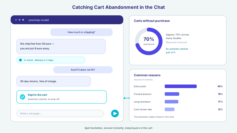
Whom the assistant addresses when should follow the context, not a blanket approach. Someone lingering on the shipping page is offered a concrete answer on cost and delivery time, not a generic discount voucher. This fit pays off: companies that excel at personalization generate 40 percent (McKinsey) more revenue from it than average players. In the shop it is worth looking at the most common friction points: apart from mere browsing, extra costs that are too high for shipping, tax and fees are by far the most common reason for abandoning at checkout; 40 percent (Baymard Institute) of surveyed online shoppers in the US have abandoned a purchase for this reason. A proactive message that openly states the shipping costs and the free-shipping threshold picks up exactly this doubt before it leads to abandonment.
Which signals the assistant evaluates and with which message it reacts can be defined precisely through tool control, so it only intervenes when it really fits. How this specifically catches cart abandonment is shown in the article on recovering cart abandonment with a shop chat; in the shop, the shop assistant bundles the fitting range of functions.
| Situation | Blanket approach (disruptive) | Context-based (helpful) |
|---|---|---|
| New visitor on the home page | Instant pop-up: do you want to chat? | Calm, visible launcher, no engagement |
| Long dwell on the shipping page | Generic discount banner | Concrete answer on shipping cost and delivery time |
| Hesitation in the cart | Repeated pop-up on every click | One-time message on the free-shipping threshold |
| Pricing page | Generic greeting | Suggestions on packages and open questions |
| Already clicked away | New pop-up on the next page | Quiet for this visit, launcher stays reachable |
Not Pushy: the Line to Being a Nuisance
Between helpful intervention and being a nuisance lies a thin line, and it runs along frequency and tone. An assistant that pops up again on every page change trains visitors to close it immediately. Someone who clicks the invitation away should have quiet for this visit; a window closed once stays closed until the visitor opens it again. Part of this is not observing covertly: the assistant reacts to signals that arise in the normal flow anyway and builds no hidden behaviour profile. Hosting and storage in Germany, a data processing agreement and a deletion concept belong to this, and the answers are generated by a specialised model provider, also outside the EU on the basis of standard contractual clauses, as the page on data protection and hosting sets out. And where a matter becomes sensitive or the assistant reaches its limits, it is meant to hand over to a human with the full conversation history as context, as the article on handover to a human agent describes.
- One invitation per visit is enough; a window clicked away stays closed for this visit
- Engage proactively only on a recognizable occasion, not on a fixed countdown for everyone
- Keep the launcher visible but discreet, without blinking or intrusive sounds
- Never cover header, navigation or buy button, especially on the smartphone
- No hidden behaviour profile, use only signals from the normal flow
- Hand over to a human at any time when the visitor wishes or the topic requires it
Measure the Effect and Adjust
Whether placement and engagement are right shows not in a feeling but in the analysis. Conversation analytics makes visible which starter messages and quick replies actually trigger replies, at which point conversations break off and whether a proactive message helps or disturbs. From these patterns come concrete adjustments: if an invitation is rarely accepted, the moment or the message is wrong; if a certain starter message leads into conversation more often than average, it belongs more prominently. If the assistant carries several languages, it is worth looking at each language separately, see multilingual assistant. How to use this analysis in detail is deepened in the article on analysing and optimising conversations; the concrete packages including hosting in Germany can be found on the pricing page.
With all its effect, an honest expectation belongs to it. A firm increase in conversion or revenue cannot be assured, because it depends on the offer, the audience, prices and competition. What is influenceable are the factors that demonstrably work: a visible, non-covering placement, engagement with judgement at the right moment and a first impression that shows what the assistant can do. An AI assistant can err; that is why it binds its statements to its own content and is meant to hand over to a human on sensitive topics. Corner, offset and the rules for proactive messages are set per assistant; how the widget gets into a site or shop with a snippet is shown on the integration page.
Frequent questions
Where should the chat widget sit on the page?
Where visitors have learned to find the chat entry, usually a round launcher in the bottom right, clearly visible but without covering important content. The Nielsen Norman Group advises keeping the chat reachable across all pages and consolidating several chat features into a single entry point. The Baymard Institute adds keeping the chat findable without covering the header, navigation or buy button. There is no single ideal solution for every page, but there are these proven guardrails.
How big should the widget be on the smartphone?
The launcher should be comfortable to tap with the thumb; the accessibility guideline WCAG 2.2 names 24 by 24 CSS pixels as the minimum size for controls, and in practice a little more is welcome. What matters is that it does not cover the header with the phone number and the navigation and keeps a fixed place so nothing jumps around when it loads. The opened chat window may be full screen but should be closeable again with a clearly visible element.
When should the assistant engage on its own?
Not on a fixed countdown and not with everyone, but when a recognizable doubt appears and there is still time to clear it, such as longer inactivity on the cart page or a repeated look at the shipping information. The Baymard Institute notes that random, site-initiated engagement is usually experienced as disruptive. The occasion decides whether the message is perceived as help or as an interruption.
Does proactive engagement not annoy visitors?
That depends on frequency, timing and message. A message that answers an open question or removes a real hurdle is experienced as a service; a blanket pop-up for every visitor, by contrast, disturbs and is clicked away. Someone who closes the invitation should have quiet for this visit. Set up this way, the assistant only intervenes on a recognizable occasion and with a fitting message instead of interrupting everyone.
What belongs in the starter message and the quick replies?
The starter message should say clearly and concisely what the assistant helps with, using two or three concrete topics instead of a vague ask-me-anything. Quick replies are suggested questions as clickable buttons that save typing and lower the hurdle of starting the conversation. The Nielsen Norman Group advises offering these suggestions as buttons and adapting them to the page currently being viewed, so they look different on a product page than on the pricing page.
Can better placement assure a certain conversion increase?
No. A firm increase in conversion or revenue depends on the offer, the audience, prices and competition and cannot be assured. What is influenceable are the factors that demonstrably work: a visible, non-covering placement, engagement with judgement at the right moment and a starter message that shows what the assistant can do. Through conversation analytics you can continuously check which settings actually bring more conversations and completions.
Ask it yourself, Assistant of this website
Automated assistant