Shop chat on smartphones: full screen, keyboard and product cards before Black Week
How a shop chat stays usable on a smartphone: input above the on-screen keyboard, product cards at narrow width, reflow and a test plan.
In plain language
Many people shop on their phones. So the shop chat must work well on a phone too.
When you type, the keyboard comes up. It must not hide the box you type in. We check this.
You can swipe the row of cards for the goods. You can also reach it with keys.
Test the chat on real phones before the sale.
Many visitors open a shop not at their desk but on a smartphone, and with it the chat. Whether an assistant helps or gets in the way there is decided in places that never stand out on a large screen: the on-screen keyboard slides over the input field, a product card sticks out over the edge, and anyone who enlarges the text loses half of the answer. This article works through these places one by one: input and on-screen keyboard, full screen by window width, product cards and the horizontally scrolling recommendation row, reflow and zoom under the WCAG 2.2 success criterion “Reflow”. On top of that come the framework of the German Accessibility Strengthening Act in its own words, a test plan for the real device before the sales week and the limits of what a chat window can do on a small screen.

Labels in the illustration
- Chat
- On-screen keyboard
- Input hidden underneath
- Floating window
- Input behind the keyboard
- Shop chat
- Rain jacket?
- Product card
- from catalogue
- View item
- Your question
- On-screen keyboard
- Full screen up to 560 pixels
- Input right above the keyboard
- 320 CSS pixels: WCAG benchmark
- SC 1.4.10, not measured for XICBOT
- Three checks at phone size
- 1
- Input stays visible
- The keyboard does not cover the input;
- the field sits directly above it
- 2
- Close is within reach
- The cross sits at the top of the header
- and closes the window
- 3
- Full screen
- The window covers the whole screen,
- by window width, not by device
- Also: the recommendation row
- It scrolls sideways and can be swiped,
- and it can also be reached by keyboard
Before Black Week: the chat in your hand
Many customers shop online on their smartphone, often on the move and with one hand. How large that share is in your own shop is shown by the breakdown by device type in the shop system or in your web analytics. The comparison with last year’s sales week is the most telling: it shows whether chat conversations on peak days come from smartphones more often than during the rest of the year.
What follows for the chat is our own assessment and not a result of the survey: if the smartphone leads in online shopping, the questions that are still open before a purchase arrive there too, about size, delivery time, the difference between two items. A chat window that was tested and approved at a desk proves little for this case. On the small screen it shares the space with the on-screen keyboard, with the browser’s address bar and with the thumb that operates it. Where a widget should sit on a smartphone, how large the launcher should be and that the opened window can be closed with a visible control is covered in the article on placing the chat widget. This article is about what comes next: typing, looking at cards, zooming in.
Tested at a desk does not mean checked on a smartphone
On the small screen it is rarely the answers that make a chat unusable, but the input field, the card width and zoom. These places can be checked on real devices before the sales week.
The on-screen keyboard: keeping the input in view
As soon as the visitor taps the input field, the smartphone shows the on-screen keyboard. Depending on device and orientation it takes up a large part of the screen; in landscape often only a narrow strip remains above it. The browser shrinks the visible area, but not in every case the area a page lays itself out against. A chat window that clings to the bottom edge of that area then ends up with its input field behind the keyboard. The visitor types without seeing what they write, or they see their field but no longer the last answer they are referring to.
This leads to three requirements that are advisable for a chat on a smartphone. The input field sits directly above the keyboard for as long as it is open. The conversation above it stays scrollable, and the last message moves into the visible part after sending. And the window does not jump when the keyboard closes: anyone who folds the keyboard away after sending in order to look at a product card calmly should find the card in the same place. A chat that misses one of these requirements does not stand out in a desk test, because there is no on-screen keyboard there.
In the XICBOT widget the mobile version is part of acceptance testing. The widget’s test track contains three checks at phone size: the opened chat window covers the whole screen, the close control can be reached and closes, and the on-screen keyboard does not cover the input. If the state cannot be determined reliably in a run, the check counts as not measured rather than passed. This is a checked property of the widget and not a promise for every device, every browser version and every page it is embedded in. Testing on your customers’ devices therefore still belongs in the preparation.
- Tap the field: The keyboard appears and the input field sits visibly right above it, not behind it.
- Type a long question: A question over several lines stays readable while it is being written; the field grows or scrolls instead of cutting text off.
- Send: The answer appears in the visible part without the visitor having to close the keyboard first.
- Fold the keyboard away: The window keeps its position, cards and conversation do not jump.
- Turn sideways: In landscape too there is room between header and keyboard for the input field and at least one line of conversation.
Anyone who dislikes typing on a smartphone often dictates. Many on-screen keyboards offer a dictation function that writes the spoken words into the same input field, so the same requirements for position and visibility apply. What voice input in the chat means beyond that is described in the article on voice input in the chat assistant.
Full screen: by window width, not by device
Whether the chat window appears as a smaller window or takes up the whole area does not depend on the device with XICBOT, but on the width. At a window width of up to and including 560 pixels the chat window switches to full screen. The loader reads the width class from the window width of the page and explicitly not from the browser identification. A tablet held upright therefore counts as what it currently is, and so does a browser window dragged narrow at a desk. How the loader hooks into a page and in which order it works is described on the page on embedding on your website.
| Window width | Presentation | What matters |
|---|---|---|
| Up to 560 pixels, for example a smartphone held upright | Full screen: the chat window covers the whole screen | The input field stays visible above the keyboard |
| Smartphone in landscape | Above or below the threshold, depending on the model | Little height remains above the keyboard, check the input field in particular |
| Above 560 pixels, for example a tablet or a desktop screen | Chat window in a smaller form | The window covers neither the header nor the buy button |
| Browser window dragged narrow at a desk | Full screen as soon as it is 560 pixels wide or less | Good for a quick pre-test, but no substitute for the device |
That the window fills the screen on a smartphone and that the close control can be found without searching is already covered in detail in the placement article; in the XICBOT widget both points are checked at phone size.
Product cards on a narrow screen
On a small screen, clicking through filters and lists is the most tedious. A product card in the chat shortens that path: it shows image, title, price, rating and delivery time from the shop’s catalogue and, depending on the settings, carries a button that leads to the cart or to the product page. The button opens the target in a new tab, and the conversation stays where it was. A line without a value does not appear on the card as an empty line but not at all; on a narrow card no space is lost to empty fields. Which card forms exist and where their data comes from is described on the page on product cards in the chat.
For operation, the structure of the card counts for more than its size. The card itself is a link or a plain frame, never a button, because a button with a link inside breaks in Safari and Firefox. The action button therefore sits next to it and includes the item title when read aloud; otherwise six cards would mean hearing the same sentence six times. For visitors who operate the smartphone with its screen reader, that is the difference between a list of identical buttons and one in which every button says where it leads.
| Card form | What it shows | What to look for on a smartphone |
|---|---|---|
| Single card | One item with image, title, price, rating and delivery time, with a button depending on the settings | A short title with the most important feature first stays readable on a narrow card too |
| Recommendation row | Several matches side by side, below the answer rather than inside it | Only a test on the device shows whether visitors notice that more cards follow |
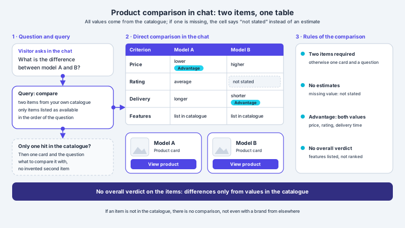
| Comparison | Two items in a table, both cards below it | Two columns on a narrow screen cope better with short values than with long feature texts |
| Bundle with anchor card | The main item and the accessories linked to it in the catalogue | The anchor card has to remain recognisable as the main item |
| Sale card | An item with a strike-through price from the catalogue | Without a maintained strike-through price it remains an ordinary card |
The recommendation row: swiping and reaching it by keyboard
If a query has more than one match, the chat shows the items as a recommendation row: several cards side by side, below the answer and not inside it, so the text stays short. On a smartphone the row is a band that scrolls horizontally. With a finger that is a matter of course, for other ways of operating it is not. Anyone operating a tablet through an attached keyboard or working with switch control does not swipe. That is why the row carries a keyboard marker in XICBOT, so that it can be reached not only by finger. It is the only card form that forms its own operating area; the other forms do without one.
A horizontally scrolling band has an advantage and a downside on a smartphone. The advantage: five cards stacked vertically would push the answer out of view, side by side it stays in place. The downside: whatever lies to the right outside the screen is not seen by the visitor, and whether they realise that more cards follow depends on the design. A cut-off next card at the right edge is a common signal for this. How your shop’s visitors actually use the row is shown not by a design principle but by a look at real conversations: questions like “Are there any others?” directly after a row can be a sign that further cards were overlooked.
A direct comparison of two items has a different structure: a table with two columns, both cards below it, the buttons deliberately below the table and not in its cells. How this table is built and why missing values appear there as “not stated” is described in the article on product comparison in the chat. On a smartphone a further question arises that matters in the next section: a data table is among the content that WCAG explicitly names as two-dimensional.
Reflow: what 320 CSS pixels demand
The Web Content Accessibility Guidelines in version 2.2 are a W3C Recommendation and a widely used technical benchmark for accessible web content. For narrow screens, success criterion 1.4.10 “Reflow” at level AA is the relevant one. It requires that content can be presented without loss of information or functionality and without having to scroll in two directions, for vertically scrolling content at a width equivalent to 320 CSS pixels (W3C). In its own words:
Content can be presented without loss of information or functionality, and without requiring scrolling in two dimensions for: Vertical scrolling content at a width equivalent to 320 CSS pixels; Horizontal scrolling content at a height equivalent to 256 CSS pixels. Except for parts of the content which require two-dimensional layout for usage or meaning.
The value is not arbitrary. A note on the criterion equates it with zooming at a desk: 320 CSS pixels correspond to a starting width of 1280 CSS pixels at 400 percent (W3C) zoom. Anyone who zooms in heavily on a large screen therefore sees roughly the same width as on a narrow smartphone. A chat window that stays usable at this width helps both groups; one that cuts off text there or slips sideways hinders both.
Exempt are parts of the content that need a two-dimensional layout for their use or meaning. The second note on the criterion gives examples, among them maps and diagrams, video, games and data tables, for tables explicitly not the individual cells: “data tables (not individual cells)”. For a shop chat this means two things. According to the note, a comparison table may scroll in two directions as a table, but the content of a single cell should reflow. And the horizontally scrolling recommendation row is a component that deliberately moves sideways while the conversation scrolls vertically. Whether such a band falls under the exception or counts as scrolling in two directions is not answered explicitly by the wording; that has to be judged case by case.
Accessibility in the law: without particular difficulty
Under Section 1(3), the German Accessibility Strengthening Act (BFSG) applies to certain services listed there that are provided to consumers after 28 June 2025; under number 5 it lists services in electronic commerce. Online shops selling to consumers can fall under this. What accessible means is set out in Section 3(1):
Products and services are accessible if they can be found, accessed and used by persons with disabilities in the generally customary manner, without particular difficulty and, in principle, without outside help.
Whether a particular defect legally amounts to a particular difficulty cannot be answered in general. The term becomes tangible, however, in places like the input field behind the on-screen keyboard: the chat is there, but only usable by detours. Which specific technical requirements apply is not laid down in the subsection itself; they follow a statutory ordinance, and WCAG is often used as the technical benchmark in this context. Under Section 3(3), subsection 1 does not apply to micro-enterprises that offer or provide services. How the act affects a chat assistant in detail is described in the article on the accessible AI assistant under the BFSG.
Zooming in: text size and magnification on a smartphone
Besides width, text size matters. Many people set a larger system font on their smartphone or zoom in with two fingers. In success criterion 1.4.4, WCAG 2.2 requires that text, except for captions and images of text, can be resized without assistive technology up to 200 percent (W3C) without loss of content or functionality. In the chat the sensitive places are predictable: a button whose label gets cut off, a card whose price slips out of its frame, an input field that grows so tall that no conversation remains above the keyboard.
The XICBOT widget is checked at double magnification: it stays operable, and a comparison measurement at normal view sits alongside it so that it is visible the magnification actually took effect. How we describe the status for our own website is set out in the accessibility statement. More on focus, contrast and scaling in the chat is in the article on the accessible assistant.
Test plan before the sales week: on the device
The most important test needs no tool, but devices as your customers use them: a smaller and a larger smartphone, ideally with different browsers, plus a tablet. A narrowed browser window at a desk shows the switch to full screen, but no on-screen keyboard, no sliding address bar and no thumb. The table summarises the test steps. How such cases become a repeatable acceptance test is described in the article on acceptance testing with test cases.
| Test step | Expected | Not expected |
|---|---|---|
| Open the chat on a smartphone | The window fills the screen, the close control is visible at the top | A small window whose close control lies outside the screen |
| Tap the input field and type a long question | The field sits above the keyboard, the typed text stays visible | Typing blind because the field lies behind the keyboard |
| Send the question, leave the keyboard open | The answer moves into the visible part | The answer sits behind the keyboard and can only be read after closing it |
| Ask for several items | A recommendation row that can be swiped and shows that more cards follow | Cards that stick out over the edge and cannot be reached |
| Have two items compared | A table with two columns, the buttons below the table | Values cut off in the cells |
| Enlarge the text in the system settings | Text, prices and buttons stay complete and operable | Cut-off labels or overlapping cards |
| Turn the device sideways | Input field and at least one line of conversation stay visible | A window with no room left above the keyboard |
One point weighs more on a smartphone than at a desk: loading itself. On the go the connection is often slower, and a chat that slows the page down does harm before it has even been opened. What the XICBOT loader costs on a page and why the chat window only loads once the page has finished loading is described in the article on the load time of the chat widget. Working through the test plan two or three weeks before the sales week leaves room for improvements to the catalogue or the embedding.
Limits: what the chat on a smartphone does not do
- It does not replace a test on real devices. The widget is checked on a test track, not on every device and in every browser version your customers use.
- It does not make a shop accessible. A chat that is easy to operate on a smartphone changes nothing about navigation, filters or checkout.
- It carries no conformance claim for success criterion 1.4.10. No measurement at a width of 320 CSS pixels exists for that.
- It does not make up for gaps in the catalogue. What is missing on the card is missing in the catalogue, and on a small screen it is more noticeable.
- It promises no effect on revenue or abandonment rate. Whether working mobile operation leads to more purchases depends on range, prices and the rest of the shop.
- It does not judge whether a shop falls under the BFSG or meets its requirements.
Frequent questions
Why should I test the shop chat on a smartphone before Black Week?
Because many purchases are prepared there. Mistakes such as a covered input field usually do not show up at a desk. A test on real devices before the sales week leaves time to fix them.
What can be done if the on-screen keyboard covers the input field?
The chat window should follow the visible area, not the full window height, so the field stays above the keyboard. In the XICBOT widget it is checked at phone size that the keyboard does not cover the input. If it still happens on a particular device, an exact note of device, browser and orientation usually helps to narrow it down.
Up to what width does the chat open full screen?
With XICBOT the chat window switches to full screen at a window width of up to and including 560 pixels. What counts is the window width of the page, not the device identification; a smartphone in landscape may therefore also show the smaller window, depending on the model.
Can the product cards be operated without swiping?
The recommendation row carries a keyboard marker and can therefore be reached with the keyboard as well, not only by finger. The action button next to the card includes the item title when read aloud. How well this works together on a particular device with an attached keyboard or screen reader is best shown by a test if in doubt.
Does the chat meet the reflow criterion at 320 CSS pixels?
We make no statement on this. What is checked is full screen, closing and input at phone size as well as operability at double magnification; there is no measurement under success criterion 1.4.10. The horizontally scrolling recommendation row also touches on the question of when scrolling in two directions is permissible, and that has to be judged case by case.
Does my shop chat have to be accessible under the BFSG?
Under Section 1(3) the act applies, among other things, to services in electronic commerce provided to consumers after 28 June 2025; micro-enterprises that offer or provide services are exempt under Section 3(3). Whether this applies to your shop and which requirements then apply is usually a question for legal advice in the individual case.
Ask it yourself, Assistant of this website
Automated assistant